The Easiest Way to Identify Brand Colors from a Website
The Easiest Way to Identify Brand Colors from a Website
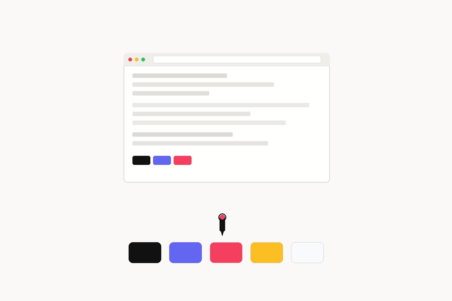
When you're doing competitive research or building a reference palette, you need exact hex values. Screenshots and eyeballing will get you close but not precise. Here are the methods I use, ordered from quickest to most thorough.
Method 1: Browser DevTools Computed Styles
Right-click any colored element and choose Inspect. In the Styles panel, look for color, background-color, or background properties. DevTools shows the value as hex, RGB, or HSL depending on what the site uses.
Click the color swatch next to any value to open the color picker. The hex field at the top is what you want.
For sites that use a design system, the real gold is in CSS custom properties. Click the <html> element and switch to the Computed tab. Filter by --color or --brand.
:root {
  --color-primary: #0f172a;
  --color-accent: #6366f1;
  --color-surface: #f8fafc;
  --color-text-muted: #64748b;
}
If you see this pattern, the full palette is right there. One place, all values, no guessing.
Method 2: Searching the Stylesheet Directly
If you want every color used across the site at once, open the Sources tab in DevTools, navigate to the main stylesheet, and run a find for #. That surfaces every hex literal in the file.
For a more systematic sweep, download the CSS and run a grep:
grep -Eo '#[0-9a-fA-F]{3,6}' styles.css | sort | uniq -c | sort -rn | head -20The count next to each value tells you usage frequency. The top five are almost always the core palette. The bottom of the list tends to be one-off hover states, legacy values, and borders that never got cleaned up.
Method 3: Reading the Logo SVG
The most canonical version of a brand's primary color is in the logo. Specifically the logo SVG, if one is served inline or linked from the HTML. SVG path fills use raw hex values from whoever exported the file from Illustrator or Figma.
In DevTools, search the page source for <svg, or filter the Network tab to SVGs and open the file. Look for fill="#" attributes:
<svg viewBox="0 0 120 40" xmlns="http://www.w3.org/2000/svg">
  <path d="M0 0 ..." fill="#1A1A2E"/>
  <path d="M40 0 ..." fill="#E94560"/>
</svg>
These fills are the brand's core colors, unchanged by component-level overrides or A/B tests.
Method 4: Design Token Files
Larger sites move color values out of CSS and into JSON or JS-based design tokens. You'll see references like color.brand.primary in the stylesheet rather than a hex literal. The actual values live in a separate tokens file, often loaded at build time.
Check the page source for linked JSON files or look for a token bundle in the Network tab. The structure looks like:
{
  "brand": {
    "primary": { "value": "#0052CC" },
    "accent": { "value": "#FF5630" },
    "neutral": {
      "100": { "value": "#F4F5F7" },
      "900": { "value": "#172B4D" }
    }
  }
}
When you find this, you have the complete semantic mapping, not just individual values.
Automated Extraction for Multiple Sites
Manual DevTools work is fine for one site. For a competitive audit across five or ten competitors, it compounds fast. To use Inspect Brand, paste any URL and get the extracted color palette, fonts, and favicon together without opening DevTools on each site.
The output is a structured palette you can drop straight into Figma or a token file:
{
  "colors": {
    "primary": "#0052CC",
    "accent": "#FF5630",
    "background": "#FFFFFF",
    "text": "#172B4D"
  }
}
For a category sweep or a new-business pitch, this turns a half-day of manual work into a few minutes.
What to Watch Out For
A/B test color swaps: Marketing pages often run tests that swap button colors. What you see on screen may not be the canonical value. Cross-check against the logo SVG or root CSS tokens to be sure.
Computed vs. declared values: The Computed tab in DevTools shows what's actually rendering, including inherited values. The Styles tab shows what was declared. For documenting a palette, you want declared values from the stylesheet or token file, not computed ones.
Opacity variants: A background-color: rgba(0, 82, 204, 0.1) is not the brand's primary color. It's an overlay using the primary with reduced opacity. Document the base hex, not the transparency variant.
Dark mode: Sites that swap palettes based on prefers-color-scheme will show you different colors depending on your system setting. Check the CSS for @media (prefers-color-scheme: dark) to see both palette sets.
What to Do With the Colors You Find
Once you have the hex values:
- Map each to a role: primary, secondary, accent, neutral, background, text
- Check contrast ratios against WCAG AA (4.5:1 minimum for body text, 3:1 for large text)
- Document as CSS custom properties or design tokens before handing off
:root {
  /* competitor-name */
  --cp-primary:    #0052CC;
  --cp-accent:     #FF5630;
  --cp-bg:         #FFFFFF;
  --cp-text:       #172B4D;
}
Keeping competitor palettes as isolated token sets in your research files means you can reference them cleanly without accidentally mixing them into your own design tokens.
---
Getting exact colors matters more than it might seem at first. A mismatch of 5-10 hex points looks the same on screen but breaks visual consistency at scale, in print, across products, or when a new team member works from your docs. Get the right values once and you never have to revisit them.